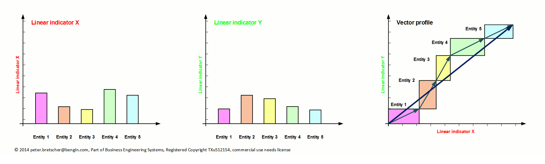
Overcoming the limits of communicating the insights that are hidden in linear metrics (numbers and graphs)
Interpreting data and graphs to detect hidden information and relationships behind it, is a challenging task. Communicating the findings precisely to other people, is again more demanding.
Using vectors for visualizing hybrid metrics is very helpful because all can see and discuss the same picture with the correlation.
And it's possible with standard Excel without macro.
Ask for more.
Applications Vector I
There are two types of "Vector I" as you can see below. One with a colored rectangle behind and one without. The one with the rectangle needs some more Excel skills and has some restrictions for negative x-values. Vectorprofiles without rectangles have no restrictions and are recommended even for the comparison of more than one profile in the same chart.


Happiness and profit
Imagine, you ask your employees in four sales regions about their happiness (x-axis) and link it with the profit of that area.
It may surprise you to see, who performs best.... and to find out his secrets.
There are several options to visualize this combination.
In the lower picture it is easier to compare the two polls from different dates.
Try it out. You only need an Excel above 2007 - and the free download.
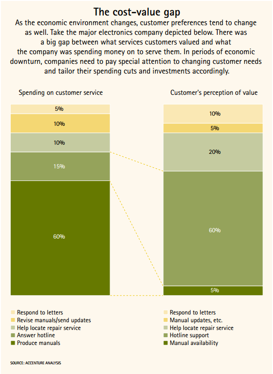

Service costs and how customers value that service
Imagine, there's a cost-value gap.
.... As the economic environment changes, customer preferences tend to change as well. Take the major electronics company depicted below. There was a big gap between what services customers valued and what the company was spending money on to serve them. In periods of economic downturn, companies need to pay special attention to changing customer needs and tailor their spending cuts and investments accordingly.
This story was written by Accenture. You can download it here.
The upper picture is from the paper. It shows the "Spending on (several types) of customer service" and "Customer's perception of value" for that type.
The lower picture is the vector profile that shows the correlations of cost and value.
Click button below to download pdf or Excel template.
Try it out. You only need an Excel above 2007 - and the free download.

Engagement in Global Workplace (gallup.com)
Shows how much of people are actively engaged (x-axis) and disengaged (y-axis) in ten nations.
The more inclined the more disengaged.
Try it out. You only need an Excel above 2007 - and the free download.

Global Wealth Vectorprofile
Horizontally is the number of people (in Million) and vertically how much they control (in US$ Trillion). Active links to the sources are in the pdf and the Excel.
The Credit Suisse Global Wealth Databook .... details the evolution of household wealth levels through the period 2000 to 2010, providing data at the regional level on high net worth individuals, and highlighting the wealth pyramid in addition to wealth analysis for 160 countries. Finally, the Databook presents detailed data on relatively under-researched areas such as gender and the composition of household portfolios (assets and debts).
Try it out. You only need an Excel above 2007 - and the free download.

Unequal ownership in EU and US
Horizontally is the % of population and vertically how much (in % of capital) they own. Clusters: "poorest", "middle", "next 9%" and "top 1%"
Active links to the sources are in the pdf and the Excel. The template is prepared for 10 clusters and two vectorprofiles.
Try it out. You only need an Excel above 2007 - and the free download.
Applications Vector II
This is the Ortscurve - where we instantaneously can see the movement over a certain period.

Ortscurve / Valuetrack
Connects several 2d-Milestones - for example, nine years track of milestones (x-axis = income, y-axis = profit .... or any two indicators; monetary, nonmonetary, objective, subjective) in an enterprise, a market, a business unit.....
Download pdf Download Excel xlsxTry it out. You only need an Excel above 2007 - and the free download.

Three Ortscurves / Valuetracks
Example for tracking 3 Enterprises.... or customers... or competitors... or....
Each in three different clusters or periods or....
Try it out. You only need an Excel above 2007 - and the free download.
Applications Vector III
This type of vector enables to expand the classic linear monetary value paradigm which. This new paradigm proposes, that there is (a) a subjective value in the real reality and the we have to create another value axis to measure this type of (subjective, nonmonetary, implicit....) value. This type of value is implicitly given, when a buyer prefers one more expensive product over another. This two "monetary fix points" are used to determine the individual use-value for the buyer.

Introducing principle of Subjective Use Value
Any valuation is based on subjective and objective criteria. To buy something is the result of an individual valuation process.
To buy a share is based on the expectation that the price of the paper would rise.
Introducing a second axis for subjective (implicit, virtual) values, combined with a specific metric (i$), allows to determine the individual SPE (Shareholders Profit Expectation, the blue vector) for any traded object.
Try it out. You only need an Excel above 2007 - and the free download.

Twitter and the Shareholders Profit Expectation
At IPO time the SPE (Shareholders Profit Expectation) is 970.000 i$.
More information is planned to released autumn 2014.
About
"Business Engineering Systems" is a set of "think-how" the problems and tasks from another point of view.
This additional perspective gives new dimensions for creating better solutions and enables new freedom for the sustainable development of economy, politics and society that has not been possible in the classic mindset.
"Business Engineering Systems" is
part of "Project NEMO" (New/Next Economic Model) and "INSEDE" (Institute for Sustainable Economic Development)
Newsletter
Coming soon.
Recent Blog Entries
-
Website of Business Engineering Systems in permanent update

-
Better design new tool for the workpiece than using an inadequate tool.

-
Ever tried to fix a screw with a hammer? Why then are you trying to run an intelligent enterprise with old economic instruments and indicators?
Time to take the consequences and alternatives.
Contact Us
Alpsteinstrasse 4, 9034 Eggersriet
Switzerland
Mobile: +41 79 650 49 04
Fixnet: +41 71 877 14 11
Email: peter.bretscher@bengin.com
IBAN: CH1809000000900180483
Stay Connected
2015/20 © Peter Bretscher. ALL Rights Reserved. Privacy Policy | Terms of Service