Get the picture beyond classic analytics and cockpits
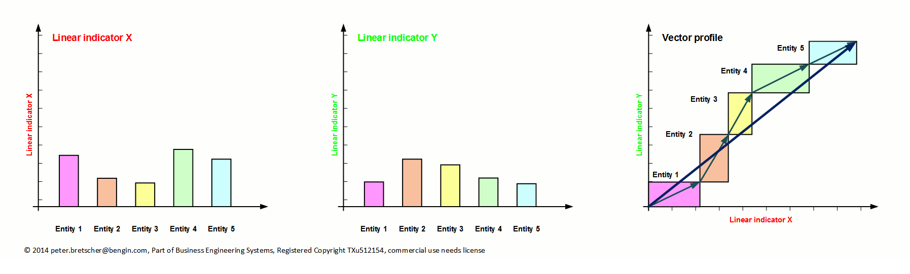
And trying to measure multi dimensional properties with linear metrics always distorts the whole picture and lefts out all "what glues the data together" in a rightful manner and makes the data meaningful.
In other words. Any decision maker who depends on linear indicators (likewise experts, computers, charts...) and is looking at different indicators one indicator after the other (or separated) will have great problems recognizing the correct relationships of the indicators. And they don't see the options that the linear metric system filters out.
How to get a better picture?
Focus of information gathering and visualization should not primarily directed to the indicators (KPIs) and classic cockpit visualizations but also to the relationship of (two) indicators - of any clusters in a given time.
Below are some frameworks with the proposed relevant indicators - and an Excel template to make the relationship of two indicators yourselves.
Take the indicators, put them into the interactive Excel below of this page and see and compare the 2D-Progress of several nations.
There's no "one solution fits all". But several excel templates for a lot of applications.
Click here to open new page with some basic templates.
Division of labor was one of great improvements in the industrialization 100 years ago. It was invented for the mass production of tangible products.
This type of "R&D" and "production" doesn't work very well in the "business of intangible products" because of "silo-experts" and "invisible interfaces".
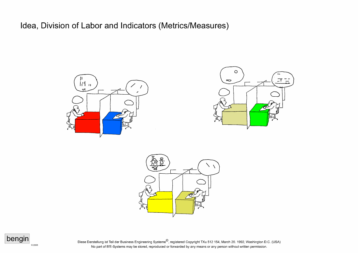
One visionary and five experts/specialists - click image for larger view.
There are several good indicators (monetary and non-monetary) to get a more holistic picture for deeper insights and better decision making in any system.
Look for the National Intangible Capital
Explore National Intangible Capital NIC in a new window here.
Look for the WEF Human Capital Index 2015 of Country
for measuring countries' ability to maximize and leverage their human capital endowment. ..
Open the Human Capital Index 2015 in a new window here.
Look for GDP (World Bank)
for measuring countries' abilities in economic (monetary) results without looking at resurces, potential or even the degree of effectiveness...
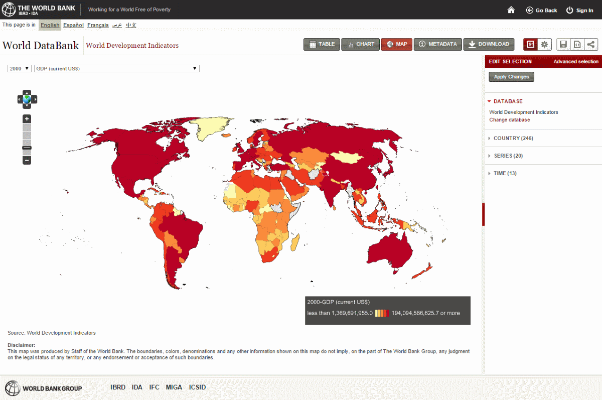
Open The World Banks GDP Map in a new window here.
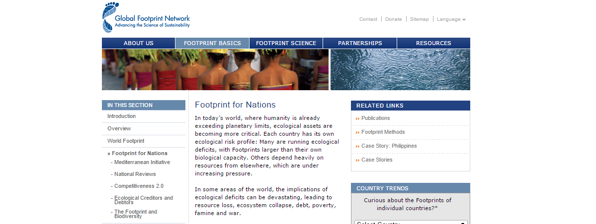
Look for the Global Footprint Network
In today’s world, where humanity is already exceeding planetary limits, ecological assets are becoming more critical...
Open the Global Footprint Network in a new window here.
See how Vector Profile works (here with one set of parameters only)
This is a test webpage and for visualization purposes only
Change the chart of indicators below.
It's an interactive Excel sheet. (Web-)Page refresh sets it back to original indicators.
Want your own Excel-Template? Download here. No E-mail, no name needed.
Find more and other templates here.
This visualization is part of "Project NEMO" (New/Next Economic Model). It's a system of economic frameworks and metrics to design an economy as if nature and people (potential and needs) matters.
We would be happy if you'd join us and go to "Project NEMO".

This work is licensed under a Creative Commons Attribution-NonCommercial-ShareAlike 4.0 International License.
About
"Business Engineering Systems" is a set of "think-how" the problems and tasks from another point of view.
This additional perspective gives new dimensions for creating better solutions and enables new freedom for the sustainable development of economy, politics and society that has not been possible in the classic mindset.
"Business Engineering Systems" is
part of "Project NEMO" (New/Next Economic Model) and "INSEDE" (Institute for Sustainable Economic Development)
Newsletter
No newsletter yet
No Recent Blog Entries


Contact Us
Alpsteinstrasse 4, 9034 Eggersriet
Switzerland
Mobile: +41 79 650 49 04
Fixnet: +41 71 877 14 11
Email: peter.bretscher@bengin.com
IBAN: CH1809000000900180483
Stay Connected
2017/20 © Peter Bretscher. ALL Rights Reserved. Privacy Policy | Terms of Service